
The Psychology Layer: Why Some Landing Pages Convert at 15% While Yours Sits at 2%
The gap between a landing page converting at 15% and one converting at 2% is rarely design or offer. Five psychological principles decide it, each backed by research.
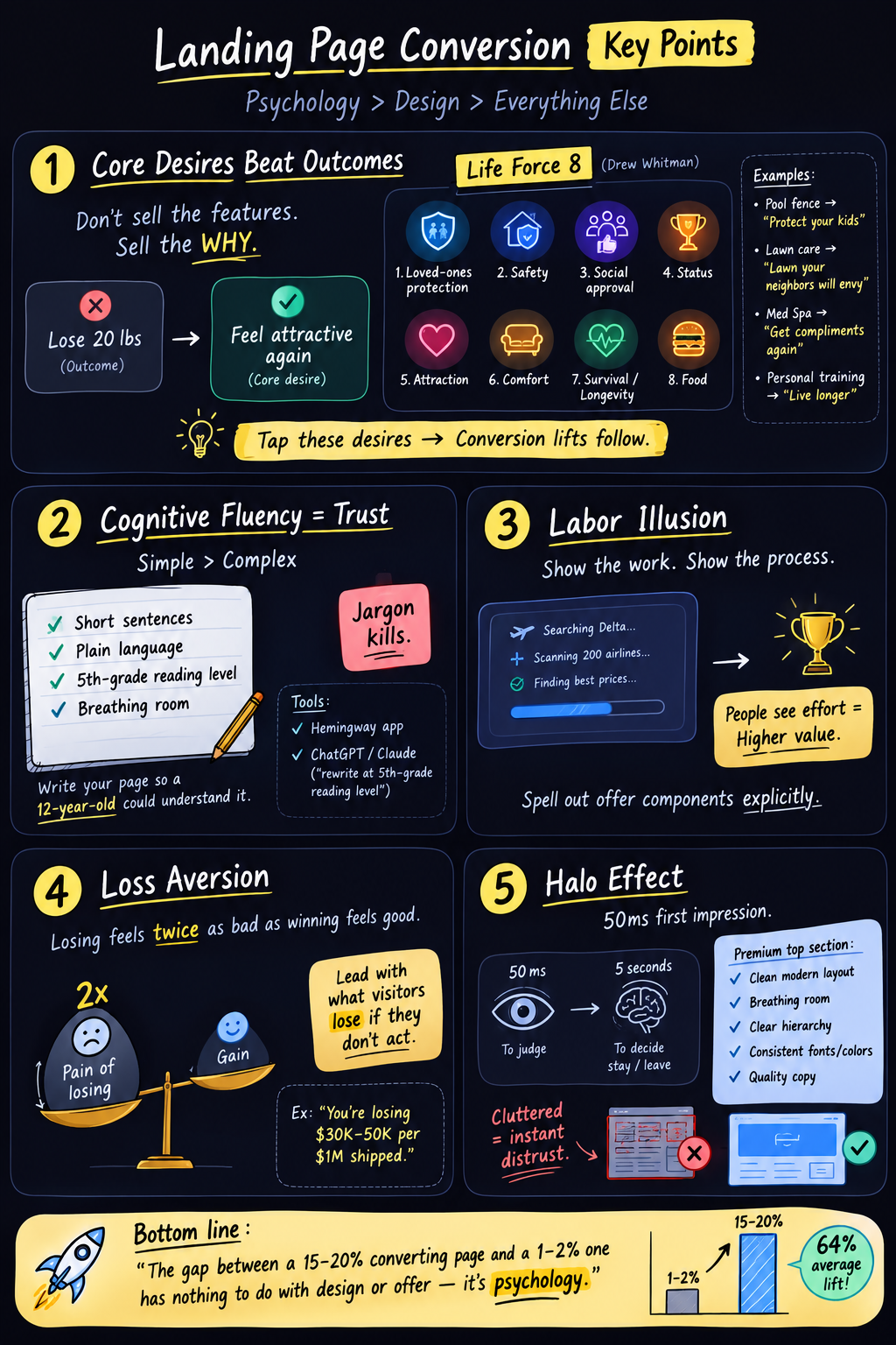
Most landing page advice obsesses over structure: hero here, social proof there, CTA above the fold. Structure matters, but it is only half the story. Underneath the layout sits a set of psychological decisions that most marketers never consciously make, and those decisions quietly control more of your conversion rate than your design and your offer combined.
That claim comes from Arsh Sanwarwala, who runs a CRO firm that has audited over 1,500 landing pages and runs dozens of A/B tests a month. His argument: the gap between a page converting at 15 to 20% and one converting at 1 to 2% is rarely the offer. It is the psychology wired into the copy and presentation.
One caveat before the principles. These are patterns that hold often, not laws that hold always. Your traffic source, price point, and market sophistication all bend them. Treat each one as a hypothesis to test, not a commandment.
1. Sell the core desire, not the outcome
"The outcome is just the surface. The core desire underneath it is what actually makes somebody take action."
You have heard "sell outcomes, not features." Go one layer deeper. Outcomes describe what the buyer gets. They skip why the buyer wants it, and the why is where the buying happens.
Nobody wants to "lose 20 pounds" as an end in itself. They want to feel attractive again, or to still be playing with their kids in twenty years. Nobody wants "more money" either. They want the security and peace of mind the money represents.
Drew Eric Whitman formalized this in his Life-Force 8: eight desires humans are biologically wired with. Protection of loved ones. Freedom from fear and danger. Social approval. Winning and status. Sexual companionship. Comfortable living. Survival and a long life. Enjoyment of food and drink.
The application is concrete. A pool fence company's headline reads "Protect your kids. Don't wait until it's too late." That is desire one and desire two in nine words. A lawn care page says "Get a lawn your neighbors will envy": social approval. A med spa leads with a testimonial about all the compliments a client started receiving: attraction, not "skin treatment results."
Takeaway: Take your current headline and ask "why do they want that?" twice in a row. Rewrite the headline around the second answer, then map every major section of the page to one of the eight desires.
2. Simple copy is trusted copy (cognitive fluency)
"The easier something is to process, the more our brain trusts it."
This one is short because the fix is short.
Cognitive fluency means processing ease gets misread as truthfulness. When a page is instantly understandable, visitors trust it more, purely because understanding it cost them nothing. The reverse holds too: jargon and dense paragraphs create friction, and friction reads as untrustworthiness even when your claims are solid.
Sanwarwala describes an IT company converting under 1% with a page full of phrases like "cybersecurity posture." Nobody outside the industry knows what that means, and the people signing the checks are often outside the industry.
Takeaway: Rewrite your page at a fifth-grade reading level. Run it through Hemingway, or hand the copy to an LLM with exactly that instruction. Short sentences, plain words, white space. If a 12-year-old cannot follow your pitch, your buyer is working too hard.
3. Show the work (the labor illusion)
"People assign more value to your product when they can see the labor that goes into it."
Harvard researchers Ryan Buell and Michael Norton demonstrated this with travel search sites. Two sites, identical prices. One returned results instantly. The other made users wait while showing its process: "searching Delta... scanning United... comparing 200 airlines." Participants rated the slower site as more trustworthy and were more likely to book there. Watching the work made the result feel more thorough.
Honestly, this is the counterintuitive one. Every performance guide tells you faster is better, and for page load it absolutely is. The labor illusion applies to perceived effort behind the offer, not to making people wait for your hero image.
On a landing page that means itemizing. A franchise client promised "up to $300k profit in your first 2 years." On its own, an unbelievable number. But when the page spelled out every component included in the package, user testing showed something specific: people suddenly understood why the price was high, and the price objection dissolved. The visible labor justified the cost.
Takeaway: Never sell a bundle as a single line. List the components, the process, the hours, the steps you handle. If your product does invisible work, make it visible (progress indicators, "here's what happens after you sign up" sections, itemized deliverables).
4. Name what they lose (loss aversion)
"Losing feels roughly twice as bad as winning feels good."
Kahneman and Tversky's most famous finding, and still one of the least used on landing pages. Most pages only describe what visitors gain. A stronger close also shows what staying put costs them.
A shipping-refunds company (they recover fees e-commerce brands are owed by UPS and FedEx) leads with: "You're losing $30k to $50k on every $1 million shipment. You just don't know it yet." The page then itemizes everything the visitor keeps losing by not acting. Same service either way, but "recover money you're owed" and "you are actively bleeding money" are different sentences to a human brain.
Use this with restraint. A page that is all doom reads as manipulation, and sophisticated buyers discount it. One sharp, true, quantified loss statement beats five vague scare lines.
Takeaway: Add one section, usually near the close, that quantifies the cost of inaction. Make it specific and defensible: money, time, risk. Then stop.
5. Win the first 50 milliseconds (the halo effect)
"People judge your entire company by the first screen they see."
Research on web first impressions (Lindgaard and colleagues) found visitors form an aesthetic judgment in as little as 50 milliseconds, and decide within seconds whether to stay. If the first screen looks premium (typography, spacing, hierarchy, copy all coherent), that positive impression halos over everything else: the product, the team, the claims. If it looks cluttered or generic, visitors write off the whole company without scrolling.
Notice the tension with where we started. The claim was that psychology beats design, yet here is a principle saying design decides everything in 50 milliseconds. The resolution: design matters enormously as a trust signal, and barely at all as decoration. A visually stunning page with outcome-only copy, jargon, and no loss framing still converts poorly. An average-looking page cannot be saved by psychology alone either. The halo gets them to read; the other four principles get them to buy.
Takeaway: Audit only your above-the-fold section. Consistent fonts, generous breathing room, one clear visual hierarchy, zero clutter. Get a stranger's five-second reaction before you ship it.
The compressed version
Five principles, one sentence each:
Sell the desire under the outcome. Write so a child understands you. Show the labor. Quantify the loss. Win the first glance.
None of this requires a redesign or a new offer. It requires rereading your page while asking a different question: not "does this look good," but "what is happening in the visitor's head at this exact scroll depth." The brands converting at 15% are not luckier or prettier. They answered that question on purpose.